
Composition: 8 Tips to Make Your Speakers Shine
July 1, 2020
Back in the days when travel was possible, I took a trip with my family to Banff National Park in Alberta, Canada. If you haven’t been, I’d highly recommend it. Maybe you’ve seen photos. The water is bright turquoise, the mountains shear and grand, the landscapes sweeping; it looks unreal, but photos don’t even do it justice. It’s the kind of place where it is nearly impossible to take a bad photo. (Unless, of course, you have clumsy thumbs like me that have a way of working their way into an embarrassing number of selfies. Come on, Ben! And you call yourself a professional!)Now I’m not trying to brag, but at the end of the trip when all the family photos were compiled and put into an album, there was a noticeable difference between my images and the photos taken by my family members. I didn’t bring a high-end professional camera; I didn’t sneak off the path to find some secret gem of a landscape. Looking at the album reminded me that the difference between a good photograph and a mediocre one has everything to do with the composition.
What is composition? It’s the harmonious and intentional arrangement of elements. The harmonious arrangement of musical notes creates a song. The harmonious arrangement of visual elements (shape, line, color, form) results in an aesthetically pleasing image.
Composition is THE most important tool in a photographer’s toolbelt. Anyone can pick up an expensive camera and click a button, just like any two-year-old can pound on the keys of a piano. Neither loud noises nor pretty mountains do a composition make. Forethought and intentionality are at the core of creating a good-looking photograph, video, illustration, design, and (dare I say it) Zoom presentation.
Do you want your speakers to look their best in their presentations? The funny thing about composition is that, while it is the most important consideration in a good-looking image, it is also the cheapest thing to fix—no equipment required. Here are a couple of simple tips that will drastically improve the composition and look of your videos.

What’s the point? (Have a clear focal point.)
Picture JLo on stage. She’s the focal point. Sure, there are backup singers, a band, backup dancers, and they’re important. But their sole purpose is to make JLo look and sound better—to point the attention of a disinterested audience member back on her.
In a landscape, finding the right focal point can be hard. There are a lot of interesting things you could choose to focus on. For Zoom video calls, it’s easy. Your speaker is the focal point. It’s obvious. But it’s important to establish that fact before discussing other compositional strategies. It’s similar to how we have to agree that JLo is the star before we can intelligently critique the backup dancers.

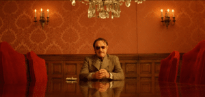
Good, Bad, or Ugly (Does the rule of thirds still apply?)
If someone knows only one compositional technique, it’s almost definitely this one. (Or maybe the ubiquitous and controversial golden ratio, but I’m not going to venture down that spiraling rabbit hole).If you’re unfamiliar with the rule of thirds, here’s a quick explanation. Plop a tic-tac-toe board down on a photo. Look, you just divided your image into horizontal and vertical thirds. The rule of thirds says that to create the most visually pleasing image, the important stuff should approximately align with the four lines, and the MOST important thing in your image (the focal point) should line up with one of the four intersecting points. Follow that simple rule and everything looks better.
Now that you know the rule, I’m going to suggest that you don’t follow it—or only follow a third of it. Since this is a presentation where the speaker is looking straight into the camera, shifting left or right to one of the vertical lines is pretty unnecessary. You can do it, and most people won’t mind, it just doesn’t gain you much. So you can ignore the intersection points and the vertical lines. The part that is still relevant to video presentations is the horizontal lines. As the most important visual in any Zoom video, the speaker’s eyes should line up with the upper horizontal line. Following that rule will fill the frame more appropriately with your subject and help the rest of the scene to fall into place.
Heads Up! But Not Too Up (Watch your speaker’s headspace.)
Once your speaker is centered horizontally (x-axis) and their eyes are positioned on the upper third line (y-axis), all that’s left to consider is the z-axis (how close or far the speaker should be from the camera. If you place your speaker’s chin just above the lower third line and give the top of their head a little breathing room near the top of the frame, they’ll be at just the right distance from the camera.
Embrace Your Wes Anderson, Minus the Weirdness (Use symmetry in your background.)
Humans like symmetry. Don’t believe me? Look at architecture, furniture, the human face, the human body. Many of the things we create or find beautiful are symmetrical. Especially when your subject is centered within the frame, using a background with symmetry on either side of the speaker will create a sense of balance and stability, and it will pull attention back to the speaker.

It’s Like Inception (Use a frame within a frame.)
While it’s important not to get carried away with using too many frames within your video frame (Don’t want to get stuck in limbo, after all), using the background elements to frame your speaker can be a very pleasing design choice. It helps keep the viewers’ eyes from wandering and reemphasizes the importance of your focal point—the speaker.
Don’t Forget Your Lines! (Take advantage of leading lines)
Remember JLo’s backup dancers we mentioned before? Let’s talk about them for another second. Backup dancers augment her performance and point the attention back to her. That’s what leading lines are all about.
Unless you’re up against a white wall, you’re probably going to have real or implied lines somewhere in your background. What you’ll want to think through is how to use these lines to point back to your speaker. Think of every line in your speaker’s background as an arrow. You’ll want to find a way to make most of the arrows point towards your speaker (your focal point) instead of pointing every which way.
Your Background Doesn’t Have to Be Profound; But Make It Deep (Consider your foreground, midground, and background.)
Humans have an aesthetic appreciation for depth. We love stargazing, seeing the hazy blue mountains on the horizon, looking over the edge of the Grand Canyon, or straining our eyes to see the other side. Nature is three-dimensional; it’s familiar; that’s why we find an illusion of depth visually pleasing in art and design. One way to add depth to a scene is through perspective and leading lines (discussed above). Another way is through layering. The speaker should probably always be in the foreground, but consider positioning the camera so that there is both a midground and a background. This will create a sense of space within the frame.
Sweep the Perimeter (Remove distractions from the edges of your frame.)
Remember how I said that my thumb is a common selfie photobomber? Things sneaking into the frame that aren’t supposed to be there are the worst—two thumbs down for sure. If objects are in the frame, they should be there boldly. No one minds if only half your painting on the wall is visible. But if only a tiny corner of the picture frame can be seen, it becomes a distraction. What is it? Is it a mistake? Is it supposed to be there? Paying attention to your edges helps to ensure a clean and professional composition.
Explore Our Latest Insights
Stay updated with our latest blog posts and trends.

Redesigning Events Starts With Asking Better Questions
I spoke on a panel recently about redesigning association events, and I’ve been thinking about one idea that kept coming up in different ways. When an event needs to change, the first question should not be, “What should we add?”
%20(1).png)
Designing Connection with Intention
At a recent event, I decided to run a small experiment on myself. It was a new community for me, and I specifically wanted to expand my network. So instead of choosing content by topic or speaker, I looked for sessions that were designed around connection. This was a challenge for me. I’m a very introverted person and I expected to feel drained at the end of each day. I was surprised to find the opposite. What I learned is something I think every event organizer should pay attention to.

How to Make Change Feel Possible
In uncertain times, familiar choices feel safer. This is why so many organizations get stuck.